 His shirt is kind of weird, but I'm happy with the light effect.
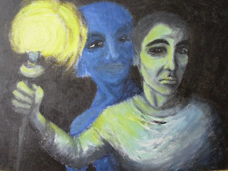
Saturday, 1 December 2007
Torchbearer.
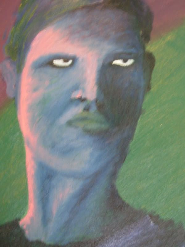
Here is finally a work I'm actually happy with. Well, let's say content with. I was going to paint out that blue female figure on the background, but being a lazy girl as I am, I didn't. It's supposed to be the cylon number six, Tricia Helfer, but looks nothing like her, of course. So I was watching Galactica at the time, the first season, and I was thrilled. If you haven't seen Galactica, you should.
His shirt is kind of weird, but I'm happy with the light effect.
His shirt is kind of weird, but I'm happy with the light effect.
Wednesday, 7 November 2007
Lighthouses are so romantic.
Here is an early attempt at a landscape. Even though I'm completely disappointed with it overall, I think I learned a couple of useful things. First, I found out how using a sponge can create a different kind of texture for the painting, surprise surprise. Second, I found out how to make an object appear to be seen through mist.
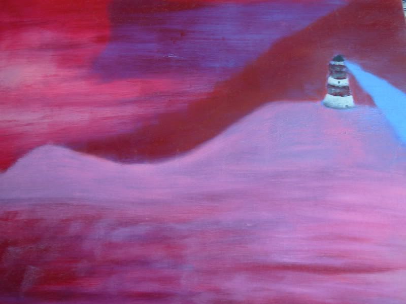 So it's not all bad I guess. Besides, my mum likes it. And don't you just love the colours? But I wish I 'd left out that weird Sauron's searchlight thingy.
I visited the navigation administration in Turku in the summer this year. I'm not terribly excited about boats and ships and seafaring, but I got this great poster:
It's this 'legendary' drawing from 1910 of Finnish lighthouses. There are more of them now, of course. The newest lighthouse at that time was the lighthouse of Bengtskär. I've been there, and it was really cool! They had a maritime center there, and a cold water aquarium in the hall. There was a cute little baby flounder... but not cute enough to make me want to set up a cold water tank. Too tricky to keep it cool.
(PIcture removed)
I've also been to Loistokari, also in the archipelago of Turku, which doesn't have a lighthouse, but a house with a window where a beacon was lit when necessary. It looked like a pretty lonely place, but it was actually quite fun visiting it. Most of the other visitors in the group were middle-aged, but they really knew how to have fun after a few drinks! The food was delicious, anyway. We ate outside on the rock (the island was nothing more than that), and we had all kinds of fish and 'saaristolaisleipä' ('bread from archipelago', badly translated):
 It's the most delicious bread in the world. Heavenly! I even got a recipe off the internet, but baking rye bread is a lot of work...but maybe some day.
But anyways, you might have guessed why I wanted the 1910 drawing of lighthouses. I'm going to use it as a model for my future endeavours at painting lighthouses. Some day.
So it's not all bad I guess. Besides, my mum likes it. And don't you just love the colours? But I wish I 'd left out that weird Sauron's searchlight thingy.I visited the navigation administration in Turku in the summer this year. I'm not terribly excited about boats and ships and seafaring, but I got this great poster:
It's this 'legendary' drawing from 1910 of Finnish lighthouses. There are more of them now, of course. The newest lighthouse at that time was the lighthouse of Bengtskär. I've been there, and it was really cool! They had a maritime center there, and a cold water aquarium in the hall. There was a cute little baby flounder... but not cute enough to make me want to set up a cold water tank. Too tricky to keep it cool.
(PIcture removed)
I've also been to Loistokari, also in the archipelago of Turku, which doesn't have a lighthouse, but a house with a window where a beacon was lit when necessary. It looked like a pretty lonely place, but it was actually quite fun visiting it. Most of the other visitors in the group were middle-aged, but they really knew how to have fun after a few drinks! The food was delicious, anyway. We ate outside on the rock (the island was nothing more than that), and we had all kinds of fish and 'saaristolaisleipä' ('bread from archipelago', badly translated):
It's the most delicious bread in the world. Heavenly! I even got a recipe off the internet, but baking rye bread is a lot of work...but maybe some day.But anyways, you might have guessed why I wanted the 1910 drawing of lighthouses. I'm going to use it as a model for my future endeavours at painting lighthouses. Some day.
Saturday, 3 November 2007
Mary in oil colours.
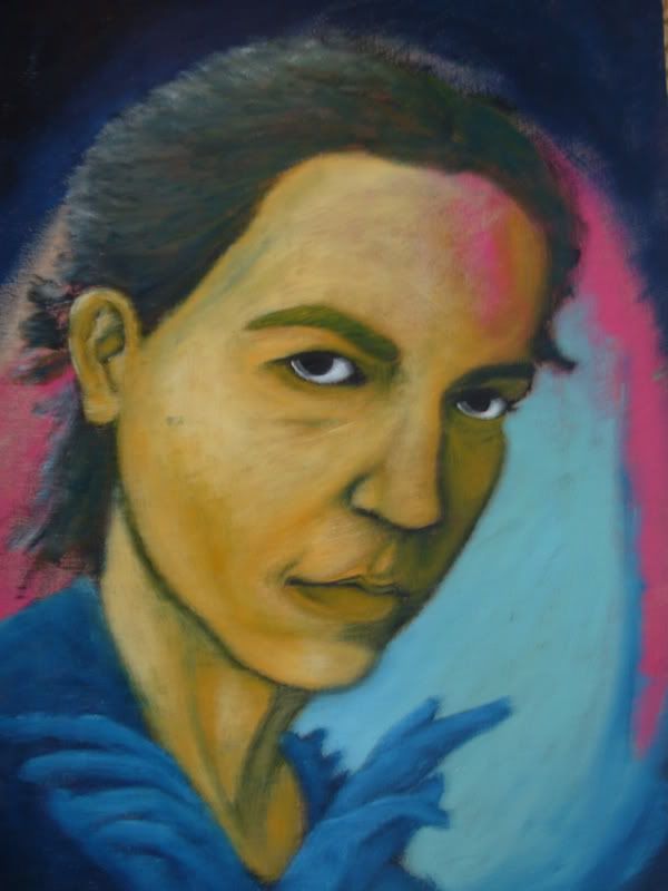
Before I painted Mary and Jesus, I actually tried to paint Mary in oil colours. But it was way too soon, I didn't know how to handle the paint - and this is the result.
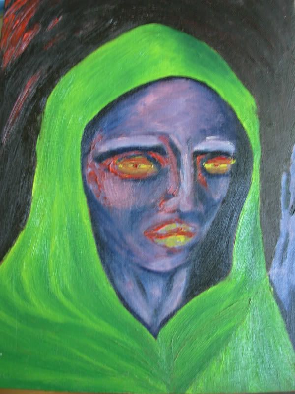
I kind of like it, though. I like the not-so-subtle shading on the edges of the face, and the way the pink hue on the temple and cheek makes it look more 3-d. I simply adore the combination of preussian blue and pink, here and in general. I also like the effect that the unmixed bright red gives. The only thing I do not like about this painting is the eyes and lips, the colour doesn't seem to fit in very well.
I noticed the quality of these pictures isn't terribly good since they're linked from my Photobucket folder. But maybe that prevents people, at least partly, from seeing how clumsy my brushwork is.
These posts keep getting shorter and shorter. I find it increasingly harder to feel inspired enough to write something worthwhile here once a week. When you're busy with a lot of stuff that drains your intellectual capacity and creativity, it is so hard to relax and actually write something interesting. Just posting the pictures isn't enough, as they're really quite boring in the end if I didn't provide some context to them. Or maybe nobody even bothers to read this, and they just look at the pictures. Hm.
Something that happened a while back made me think about this. An old French "friend" of mine heard that I have started a blog, and wanted to see it. His initial reaction was, "so much text". Ok... that's what blogs are mainly about, right? I realize my first posts were rather long, but I've seen longer. Anyway, after he'd read it all, his response was "that's it". "That's it"?? First he complains about the amount of text, then he's dissappointed with how little there was of it?? Can someone please tell me why the French are so weird, annoying and impolite??! Well, I know they're not all bad. I know many nice French people. But this particular person just drives me off the wall all the time. ALL the time. He's so arrogant everytime I talk to him, and I can't stand arrogant people. It's the worst quality in people isn't it?
Another French friend of mine also had the chance to see this blog. He didn't read the text at all, just looked at the pictures, and actually thought ALL the pictures were painted by me. Well, they aren't - there are a couple by Van Gogh and Gallen-Kallela. But I didn't bother correcting him, as I'm so fed up with French people misunderstanding me, either due to differences in our personalities or due to their bad understanding of English. But this guy is really nice in general so I don't mind it too much.
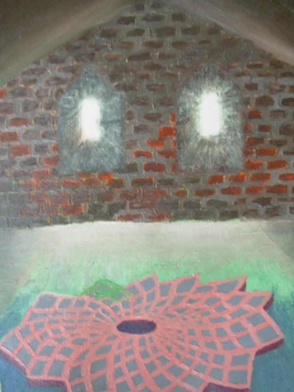
Tuesday, 30 October 2007
FPS Inspiration.
Believe it or not, this painting was inspired by a computer game. This was back when Half-Life 2 had just come out, in 2004 to be precise, (or, alternatively, when I was playing it for the umpteenth time), and I was completely taken by its visual look and atmosphere.
 Here is a lovely screenshot from the game:
(Picture removed)
My painting was actually inspired by an add-on to the game, Half-Life 2: the Lost Coast. It is a map that was dropped out of the game, which doesn't mean it isn't a great map. The map takes place in a small fishing village located in a small bay, and up on a hill there is a really nice little chapel.
(Picture removed)
The windows in my painting and the light coming from them were pretty much inspired by this lovely view, and look totally pathetic and drab compared to the original. The whole game is non-stop eye candy, so if you're into FPS games, you should definitely try it.
Actually, the second episode has just come out, and I ordered it online. I can't wait to get to play it on my laptop which doesn't even support it with any but impossibly low graphics settings!
Here is a lovely screenshot from the game:(Picture removed)
My painting was actually inspired by an add-on to the game, Half-Life 2: the Lost Coast. It is a map that was dropped out of the game, which doesn't mean it isn't a great map. The map takes place in a small fishing village located in a small bay, and up on a hill there is a really nice little chapel.
(Picture removed)
The windows in my painting and the light coming from them were pretty much inspired by this lovely view, and look totally pathetic and drab compared to the original. The whole game is non-stop eye candy, so if you're into FPS games, you should definitely try it.
Actually, the second episode has just come out, and I ordered it online. I can't wait to get to play it on my laptop which doesn't even support it with any but impossibly low graphics settings!
Friday, 5 October 2007
Experimenting with techniques.
Here's another picture done on plywood.
 Even though this 'person' looks kinda weird, I really like the way I used pink to create the impression of light coming from the left. It makes me think of twilight. And the unfinished look is nice sometimes, you know, when you don't try to make the transitions from light to shadow as smooth as possible, but leave it a little rugged, as if it was hastily done. Which it probably actually was, but that's beside the point. I know painters who don't paint hastily, they just make it look like they did.
I'm talking about the way Van Gogh painted. Well, actually I think he did have a sort of maniacal way of wielding his brush... Which is why he sadly wasn't appreciated in his time. I'm not very interested in the subject-matters in his paintings, but I really like his technique. Take this one, for example (go here if you don't see the picture: http://www.abm-enterprises.net/artgall2/vangogh_skull_cigarette.jpg):
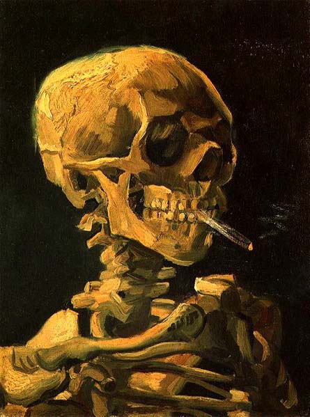 Some of the vertebrae of the neck are painted with a single brush stroke (or it's made to look like it). And the effects of light are created with very few strokes overall. Amazing. Plus, this is the most interesting of his works, actually I'm dubious about whether this really is by Van Gogh. It's too witty. Too amusing. Wasn't he depressed most of the time? Anguished and tormented like all good artists?
If only I could really paint like this - I dont' think I'm talented enough to get everything right the first time. But I'm not a big believer of talent as a concept; I think you can achieve nearly anything if you practise hard enough and long enough. No, it's not wishful thinking at all!
Even though this 'person' looks kinda weird, I really like the way I used pink to create the impression of light coming from the left. It makes me think of twilight. And the unfinished look is nice sometimes, you know, when you don't try to make the transitions from light to shadow as smooth as possible, but leave it a little rugged, as if it was hastily done. Which it probably actually was, but that's beside the point. I know painters who don't paint hastily, they just make it look like they did.I'm talking about the way Van Gogh painted. Well, actually I think he did have a sort of maniacal way of wielding his brush... Which is why he sadly wasn't appreciated in his time. I'm not very interested in the subject-matters in his paintings, but I really like his technique. Take this one, for example (go here if you don't see the picture: http://www.abm-enterprises.net/artgall2/vangogh_skull_cigarette.jpg):
Some of the vertebrae of the neck are painted with a single brush stroke (or it's made to look like it). And the effects of light are created with very few strokes overall. Amazing. Plus, this is the most interesting of his works, actually I'm dubious about whether this really is by Van Gogh. It's too witty. Too amusing. Wasn't he depressed most of the time? Anguished and tormented like all good artists?If only I could really paint like this - I dont' think I'm talented enough to get everything right the first time. But I'm not a big believer of talent as a concept; I think you can achieve nearly anything if you practise hard enough and long enough. No, it's not wishful thinking at all!
Thursday, 27 September 2007
My first self-portrait.
This was done alla prima on a plywood board. It's supposed to look like me, but... it was my first attempt at a self-portrait, so I'm not too bummed it doesn't look much like me. At least I hope it doesn't...
Usually I start by drawing the contours of a character with black, then fill it with some nice colour, then add white to create light, to try and create some form for the picture. Finally, I add more black to sharpen the lines and to finish the shadows more carefully. If I'm feeling calm and patient, I can go on for hours, trying to get the shadows and the form just right, especially if I'm painting a portrait. If the curve of a cheek isn't exactly as it should be, the picture just won't do justice to the real person...
Since I painted on plywood, it was actually very easy to use the alla prima technique. The wood just soaks up all the paint very quickly, especially if you only add small amounts at a time, so it was easy to finish it in a few hours without a messy result. I wish I had more plywood boards, it keeps the paint perfectly moist yet not too wet. It's so easy to keep perfecting the contours and blending the shadows as subtly as possible. A whole another issue is whether the paint will peel off over time, since the oil has been absorbed into the wood...
It just occurred to me that the Simpsons have yellow skin colour, as well. A reference to the Simpsons was not what I was going after.
Friday, 21 September 2007
Soaring ambitions.
After a while, I knew I liked linear painting. Hugeously. Humongously. It is probably why I'm so fond of Akseli Gallen-Kallela, one of the internationally most famous artists in Finland in his time.
He visualized the national epic of Finland, Kalevala, in a completely original way. Here is an example, called Lemminkäisen äiti, depicting Lemminkäinen and his mother. Lemminkäinen was a kind of a tragic hero, who shot a swan and got thrown into the river of Tuonela (a kind of an underworld) by some lapplander, and his mother had to fish him out and put him back together. Poor guy was only doing what he was told by an evil woman, Louhi, who had promised Lemminkäinen the daughter of Pohjola as a bride.

Gallen- Kallela often used clear, dark outlines, and the paintings depicting stories from Kalevala were all painted like this. I'm not a huge fan of Gallen-Kallela's other works, even though they're interesting in their own right and skillfully done (the following is called Ad Astra, which means "towards the stars" or something like that):
 His other works are either symbolist, or depict African scenery. I'm not that much into symbolism, and I'm not so crazy about Africa, either. It's the Kalevala pictures I like the most. The linear style was often combined with a realistic painting of the actual figures in the pictures, and that's what I nowadays always do without even thinking about it.
So here's one of my first attempts at linear painting. I was quite cautious about smudging the outlines with the inner colour.
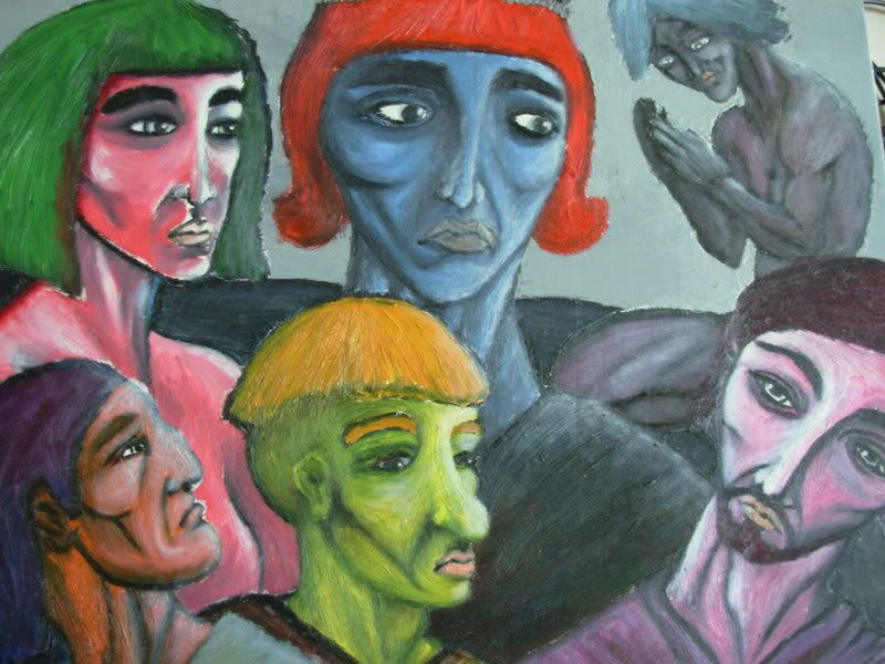 The composition is pretty confusing, there's no perspective, and all the figures stare in different directions. The painting as a whole is hard to take in, so I've divided it in individual portraits.
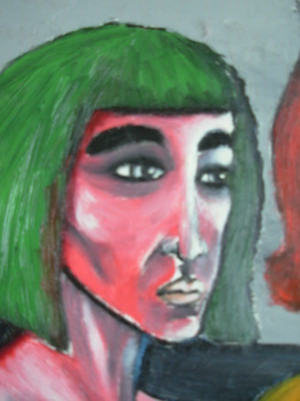
This is supposed to be an Egyptian woman. I'm not sure if there's anything Egyptian to her features except the hairstyle, and perhaps the thick eyebrows (remember Elizabeth Taylor from Cleopatra?). However, I adore the combination of grass green, white and salmon.
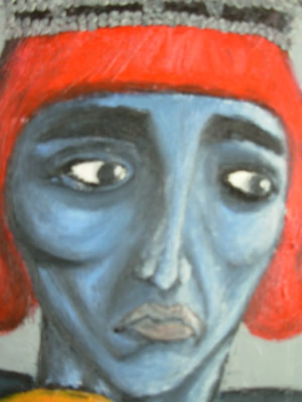
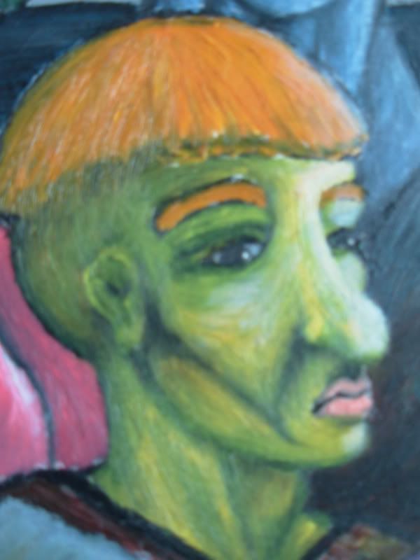
 This one's a guy with a crown and a princely hairdo. He looks pretty weird, even aside from the expression on his face. At this point, I knew the painting was going to be a mess.
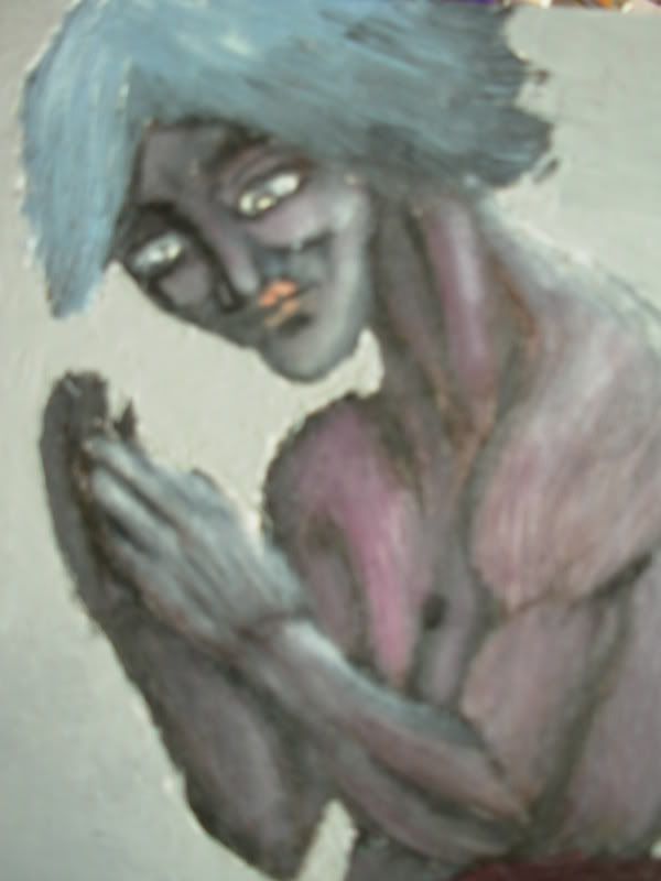
 This guy's the only one with a body. It looks horrible. Horrible.
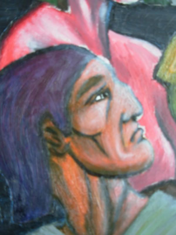
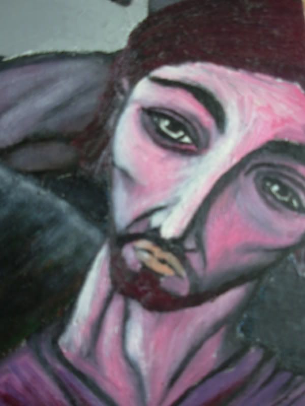
 I think I was going for a Greek profile here.
 Hmm. Horrible.
 This one I actually like. The colours, that is.
 There are no words to describe these really... I'm glad I've come a long way since this painting.
He visualized the national epic of Finland, Kalevala, in a completely original way. Here is an example, called Lemminkäisen äiti, depicting Lemminkäinen and his mother. Lemminkäinen was a kind of a tragic hero, who shot a swan and got thrown into the river of Tuonela (a kind of an underworld) by some lapplander, and his mother had to fish him out and put him back together. Poor guy was only doing what he was told by an evil woman, Louhi, who had promised Lemminkäinen the daughter of Pohjola as a bride.

Gallen- Kallela often used clear, dark outlines, and the paintings depicting stories from Kalevala were all painted like this. I'm not a huge fan of Gallen-Kallela's other works, even though they're interesting in their own right and skillfully done (the following is called Ad Astra, which means "towards the stars" or something like that):
 His other works are either symbolist, or depict African scenery. I'm not that much into symbolism, and I'm not so crazy about Africa, either. It's the Kalevala pictures I like the most. The linear style was often combined with a realistic painting of the actual figures in the pictures, and that's what I nowadays always do without even thinking about it.
So here's one of my first attempts at linear painting. I was quite cautious about smudging the outlines with the inner colour.
The composition is pretty confusing, there's no perspective, and all the figures stare in different directions. The painting as a whole is hard to take in, so I've divided it in individual portraits.This is supposed to be an Egyptian woman. I'm not sure if there's anything Egyptian to her features except the hairstyle, and perhaps the thick eyebrows (remember Elizabeth Taylor from Cleopatra?). However, I adore the combination of grass green, white and salmon.
This one's a guy with a crown and a princely hairdo. He looks pretty weird, even aside from the expression on his face. At this point, I knew the painting was going to be a mess.This guy's the only one with a body. It looks horrible. Horrible.I think I was going for a Greek profile here.Hmm. Horrible.This one I actually like. The colours, that is.There are no words to describe these really... I'm glad I've come a long way since this painting.
Subscribe to:
Posts (Atom)