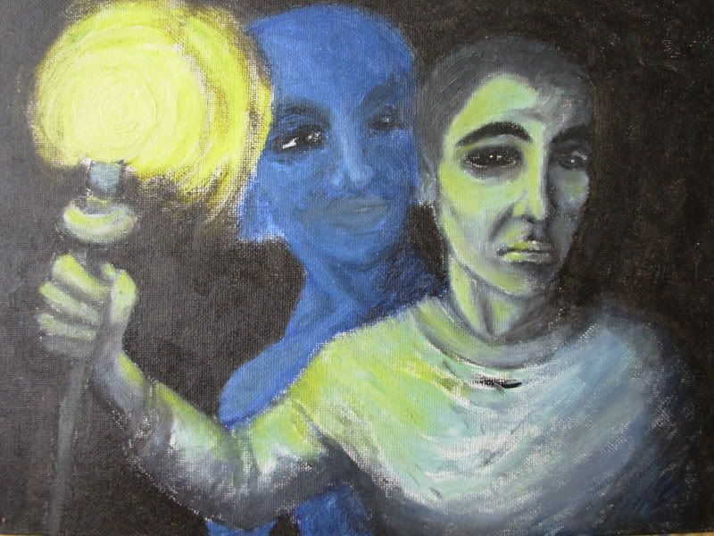
 His shirt is kind of weird, but I'm happy with the light effect.
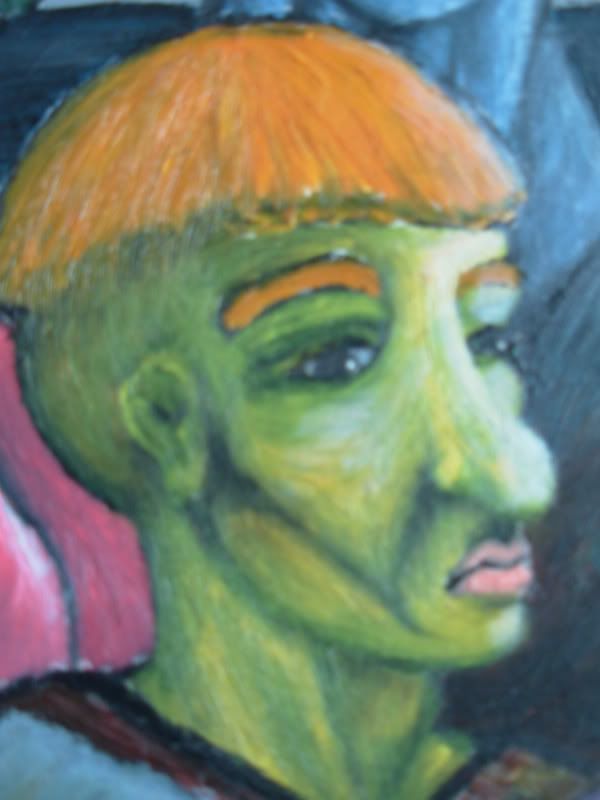
Saturday, 1 December 2007
Torchbearer.
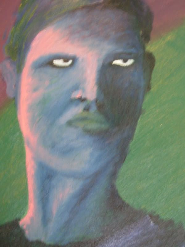
Here is finally a work I'm actually happy with. Well, let's say content with. I was going to paint out that blue female figure on the background, but being a lazy girl as I am, I didn't. It's supposed to be the cylon number six, Tricia Helfer, but looks nothing like her, of course. So I was watching Galactica at the time, the first season, and I was thrilled. If you haven't seen Galactica, you should.
His shirt is kind of weird, but I'm happy with the light effect.
His shirt is kind of weird, but I'm happy with the light effect.
Wednesday, 7 November 2007
Lighthouses are so romantic.
Here is an early attempt at a landscape. Even though I'm completely disappointed with it overall, I think I learned a couple of useful things. First, I found out how using a sponge can create a different kind of texture for the painting, surprise surprise. Second, I found out how to make an object appear to be seen through mist.
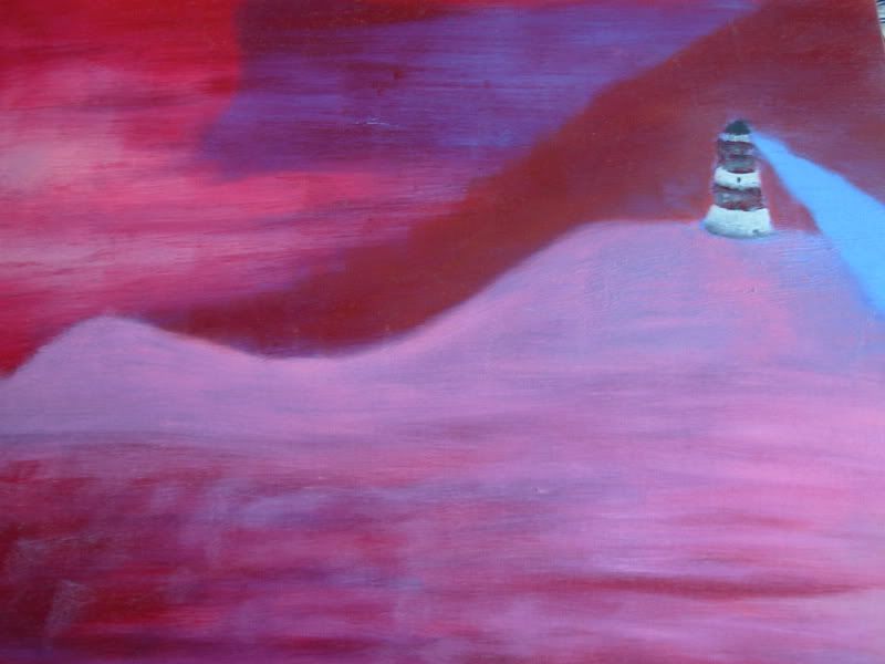 So it's not all bad I guess. Besides, my mum likes it. And don't you just love the colours? But I wish I 'd left out that weird Sauron's searchlight thingy.
I visited the navigation administration in Turku in the summer this year. I'm not terribly excited about boats and ships and seafaring, but I got this great poster:
It's this 'legendary' drawing from 1910 of Finnish lighthouses. There are more of them now, of course. The newest lighthouse at that time was the lighthouse of Bengtskär. I've been there, and it was really cool! They had a maritime center there, and a cold water aquarium in the hall. There was a cute little baby flounder... but not cute enough to make me want to set up a cold water tank. Too tricky to keep it cool.
(PIcture removed)
I've also been to Loistokari, also in the archipelago of Turku, which doesn't have a lighthouse, but a house with a window where a beacon was lit when necessary. It looked like a pretty lonely place, but it was actually quite fun visiting it. Most of the other visitors in the group were middle-aged, but they really knew how to have fun after a few drinks! The food was delicious, anyway. We ate outside on the rock (the island was nothing more than that), and we had all kinds of fish and 'saaristolaisleipä' ('bread from archipelago', badly translated):
 It's the most delicious bread in the world. Heavenly! I even got a recipe off the internet, but baking rye bread is a lot of work...but maybe some day.
But anyways, you might have guessed why I wanted the 1910 drawing of lighthouses. I'm going to use it as a model for my future endeavours at painting lighthouses. Some day.
So it's not all bad I guess. Besides, my mum likes it. And don't you just love the colours? But I wish I 'd left out that weird Sauron's searchlight thingy.I visited the navigation administration in Turku in the summer this year. I'm not terribly excited about boats and ships and seafaring, but I got this great poster:
It's this 'legendary' drawing from 1910 of Finnish lighthouses. There are more of them now, of course. The newest lighthouse at that time was the lighthouse of Bengtskär. I've been there, and it was really cool! They had a maritime center there, and a cold water aquarium in the hall. There was a cute little baby flounder... but not cute enough to make me want to set up a cold water tank. Too tricky to keep it cool.
(PIcture removed)
I've also been to Loistokari, also in the archipelago of Turku, which doesn't have a lighthouse, but a house with a window where a beacon was lit when necessary. It looked like a pretty lonely place, but it was actually quite fun visiting it. Most of the other visitors in the group were middle-aged, but they really knew how to have fun after a few drinks! The food was delicious, anyway. We ate outside on the rock (the island was nothing more than that), and we had all kinds of fish and 'saaristolaisleipä' ('bread from archipelago', badly translated):
It's the most delicious bread in the world. Heavenly! I even got a recipe off the internet, but baking rye bread is a lot of work...but maybe some day.But anyways, you might have guessed why I wanted the 1910 drawing of lighthouses. I'm going to use it as a model for my future endeavours at painting lighthouses. Some day.
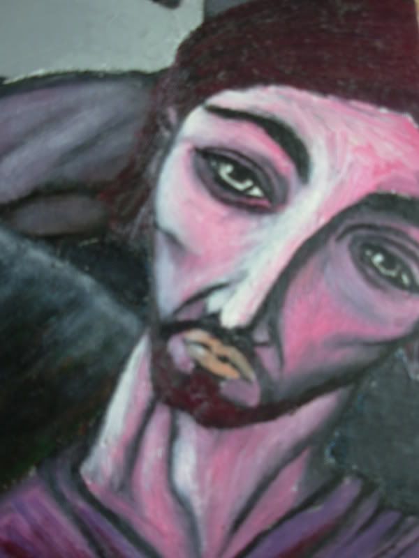
Saturday, 3 November 2007
Mary in oil colours.
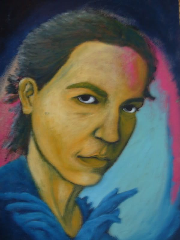
Before I painted Mary and Jesus, I actually tried to paint Mary in oil colours. But it was way too soon, I didn't know how to handle the paint - and this is the result.
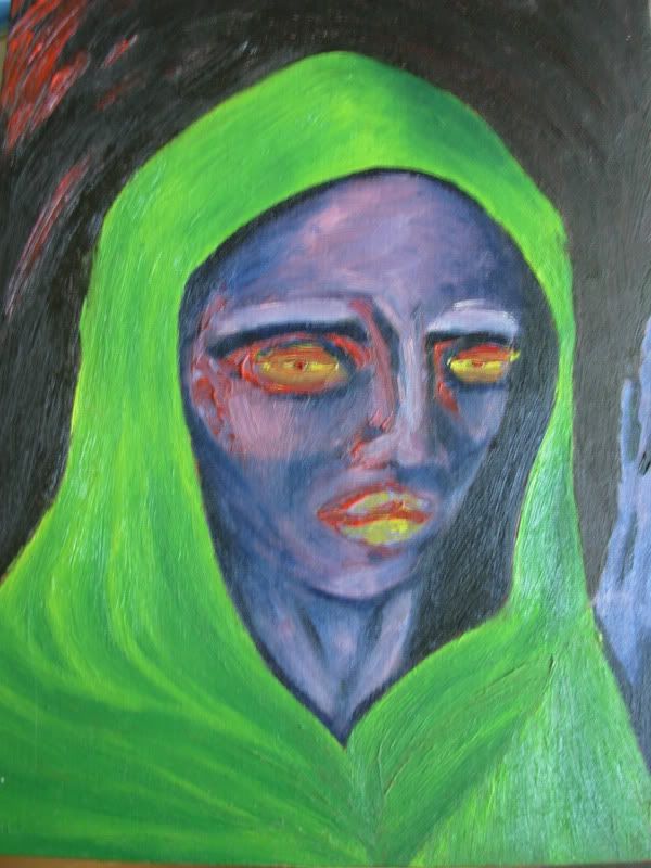
I kind of like it, though. I like the not-so-subtle shading on the edges of the face, and the way the pink hue on the temple and cheek makes it look more 3-d. I simply adore the combination of preussian blue and pink, here and in general. I also like the effect that the unmixed bright red gives. The only thing I do not like about this painting is the eyes and lips, the colour doesn't seem to fit in very well.
I noticed the quality of these pictures isn't terribly good since they're linked from my Photobucket folder. But maybe that prevents people, at least partly, from seeing how clumsy my brushwork is.
These posts keep getting shorter and shorter. I find it increasingly harder to feel inspired enough to write something worthwhile here once a week. When you're busy with a lot of stuff that drains your intellectual capacity and creativity, it is so hard to relax and actually write something interesting. Just posting the pictures isn't enough, as they're really quite boring in the end if I didn't provide some context to them. Or maybe nobody even bothers to read this, and they just look at the pictures. Hm.
Something that happened a while back made me think about this. An old French "friend" of mine heard that I have started a blog, and wanted to see it. His initial reaction was, "so much text". Ok... that's what blogs are mainly about, right? I realize my first posts were rather long, but I've seen longer. Anyway, after he'd read it all, his response was "that's it". "That's it"?? First he complains about the amount of text, then he's dissappointed with how little there was of it?? Can someone please tell me why the French are so weird, annoying and impolite??! Well, I know they're not all bad. I know many nice French people. But this particular person just drives me off the wall all the time. ALL the time. He's so arrogant everytime I talk to him, and I can't stand arrogant people. It's the worst quality in people isn't it?
Another French friend of mine also had the chance to see this blog. He didn't read the text at all, just looked at the pictures, and actually thought ALL the pictures were painted by me. Well, they aren't - there are a couple by Van Gogh and Gallen-Kallela. But I didn't bother correcting him, as I'm so fed up with French people misunderstanding me, either due to differences in our personalities or due to their bad understanding of English. But this guy is really nice in general so I don't mind it too much.
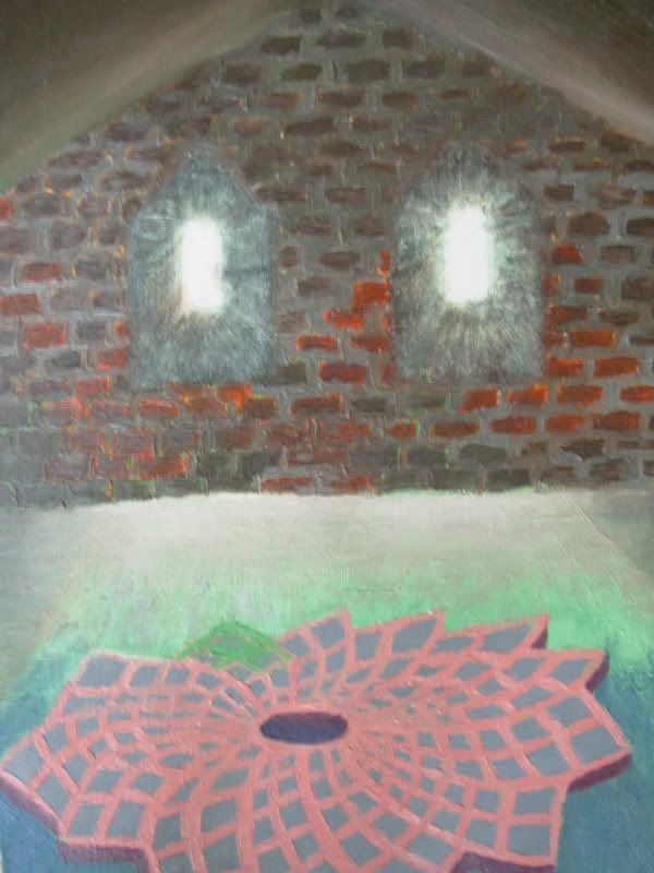
Tuesday, 30 October 2007
FPS Inspiration.
Believe it or not, this painting was inspired by a computer game. This was back when Half-Life 2 had just come out, in 2004 to be precise, (or, alternatively, when I was playing it for the umpteenth time), and I was completely taken by its visual look and atmosphere.
 Here is a lovely screenshot from the game:
(Picture removed)
My painting was actually inspired by an add-on to the game, Half-Life 2: the Lost Coast. It is a map that was dropped out of the game, which doesn't mean it isn't a great map. The map takes place in a small fishing village located in a small bay, and up on a hill there is a really nice little chapel.
(Picture removed)
The windows in my painting and the light coming from them were pretty much inspired by this lovely view, and look totally pathetic and drab compared to the original. The whole game is non-stop eye candy, so if you're into FPS games, you should definitely try it.
Actually, the second episode has just come out, and I ordered it online. I can't wait to get to play it on my laptop which doesn't even support it with any but impossibly low graphics settings!
Here is a lovely screenshot from the game:(Picture removed)
My painting was actually inspired by an add-on to the game, Half-Life 2: the Lost Coast. It is a map that was dropped out of the game, which doesn't mean it isn't a great map. The map takes place in a small fishing village located in a small bay, and up on a hill there is a really nice little chapel.
(Picture removed)
The windows in my painting and the light coming from them were pretty much inspired by this lovely view, and look totally pathetic and drab compared to the original. The whole game is non-stop eye candy, so if you're into FPS games, you should definitely try it.
Actually, the second episode has just come out, and I ordered it online. I can't wait to get to play it on my laptop which doesn't even support it with any but impossibly low graphics settings!
Friday, 5 October 2007
Experimenting with techniques.
Here's another picture done on plywood.
 Even though this 'person' looks kinda weird, I really like the way I used pink to create the impression of light coming from the left. It makes me think of twilight. And the unfinished look is nice sometimes, you know, when you don't try to make the transitions from light to shadow as smooth as possible, but leave it a little rugged, as if it was hastily done. Which it probably actually was, but that's beside the point. I know painters who don't paint hastily, they just make it look like they did.
I'm talking about the way Van Gogh painted. Well, actually I think he did have a sort of maniacal way of wielding his brush... Which is why he sadly wasn't appreciated in his time. I'm not very interested in the subject-matters in his paintings, but I really like his technique. Take this one, for example (go here if you don't see the picture: http://www.abm-enterprises.net/artgall2/vangogh_skull_cigarette.jpg):
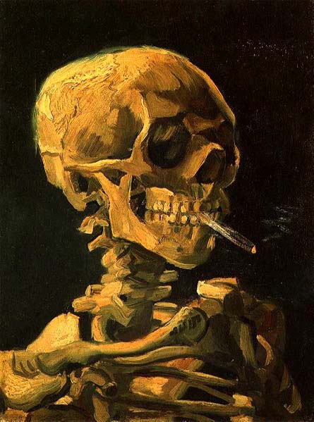 Some of the vertebrae of the neck are painted with a single brush stroke (or it's made to look like it). And the effects of light are created with very few strokes overall. Amazing. Plus, this is the most interesting of his works, actually I'm dubious about whether this really is by Van Gogh. It's too witty. Too amusing. Wasn't he depressed most of the time? Anguished and tormented like all good artists?
If only I could really paint like this - I dont' think I'm talented enough to get everything right the first time. But I'm not a big believer of talent as a concept; I think you can achieve nearly anything if you practise hard enough and long enough. No, it's not wishful thinking at all!
Even though this 'person' looks kinda weird, I really like the way I used pink to create the impression of light coming from the left. It makes me think of twilight. And the unfinished look is nice sometimes, you know, when you don't try to make the transitions from light to shadow as smooth as possible, but leave it a little rugged, as if it was hastily done. Which it probably actually was, but that's beside the point. I know painters who don't paint hastily, they just make it look like they did.I'm talking about the way Van Gogh painted. Well, actually I think he did have a sort of maniacal way of wielding his brush... Which is why he sadly wasn't appreciated in his time. I'm not very interested in the subject-matters in his paintings, but I really like his technique. Take this one, for example (go here if you don't see the picture: http://www.abm-enterprises.net/artgall2/vangogh_skull_cigarette.jpg):
Some of the vertebrae of the neck are painted with a single brush stroke (or it's made to look like it). And the effects of light are created with very few strokes overall. Amazing. Plus, this is the most interesting of his works, actually I'm dubious about whether this really is by Van Gogh. It's too witty. Too amusing. Wasn't he depressed most of the time? Anguished and tormented like all good artists?If only I could really paint like this - I dont' think I'm talented enough to get everything right the first time. But I'm not a big believer of talent as a concept; I think you can achieve nearly anything if you practise hard enough and long enough. No, it's not wishful thinking at all!
Thursday, 27 September 2007
My first self-portrait.
This was done alla prima on a plywood board. It's supposed to look like me, but... it was my first attempt at a self-portrait, so I'm not too bummed it doesn't look much like me. At least I hope it doesn't...
Usually I start by drawing the contours of a character with black, then fill it with some nice colour, then add white to create light, to try and create some form for the picture. Finally, I add more black to sharpen the lines and to finish the shadows more carefully. If I'm feeling calm and patient, I can go on for hours, trying to get the shadows and the form just right, especially if I'm painting a portrait. If the curve of a cheek isn't exactly as it should be, the picture just won't do justice to the real person...
Since I painted on plywood, it was actually very easy to use the alla prima technique. The wood just soaks up all the paint very quickly, especially if you only add small amounts at a time, so it was easy to finish it in a few hours without a messy result. I wish I had more plywood boards, it keeps the paint perfectly moist yet not too wet. It's so easy to keep perfecting the contours and blending the shadows as subtly as possible. A whole another issue is whether the paint will peel off over time, since the oil has been absorbed into the wood...
It just occurred to me that the Simpsons have yellow skin colour, as well. A reference to the Simpsons was not what I was going after.
Friday, 21 September 2007
Soaring ambitions.
After a while, I knew I liked linear painting. Hugeously. Humongously. It is probably why I'm so fond of Akseli Gallen-Kallela, one of the internationally most famous artists in Finland in his time.
He visualized the national epic of Finland, Kalevala, in a completely original way. Here is an example, called Lemminkäisen äiti, depicting Lemminkäinen and his mother. Lemminkäinen was a kind of a tragic hero, who shot a swan and got thrown into the river of Tuonela (a kind of an underworld) by some lapplander, and his mother had to fish him out and put him back together. Poor guy was only doing what he was told by an evil woman, Louhi, who had promised Lemminkäinen the daughter of Pohjola as a bride.

Gallen- Kallela often used clear, dark outlines, and the paintings depicting stories from Kalevala were all painted like this. I'm not a huge fan of Gallen-Kallela's other works, even though they're interesting in their own right and skillfully done (the following is called Ad Astra, which means "towards the stars" or something like that):
 His other works are either symbolist, or depict African scenery. I'm not that much into symbolism, and I'm not so crazy about Africa, either. It's the Kalevala pictures I like the most. The linear style was often combined with a realistic painting of the actual figures in the pictures, and that's what I nowadays always do without even thinking about it.
So here's one of my first attempts at linear painting. I was quite cautious about smudging the outlines with the inner colour.
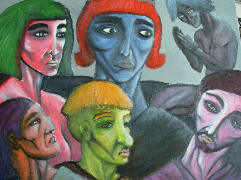 The composition is pretty confusing, there's no perspective, and all the figures stare in different directions. The painting as a whole is hard to take in, so I've divided it in individual portraits.
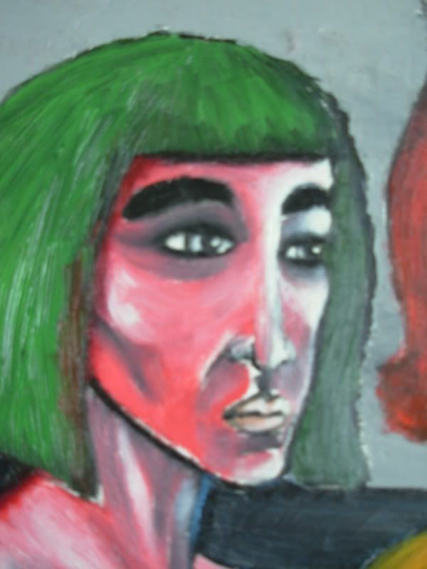
This is supposed to be an Egyptian woman. I'm not sure if there's anything Egyptian to her features except the hairstyle, and perhaps the thick eyebrows (remember Elizabeth Taylor from Cleopatra?). However, I adore the combination of grass green, white and salmon.
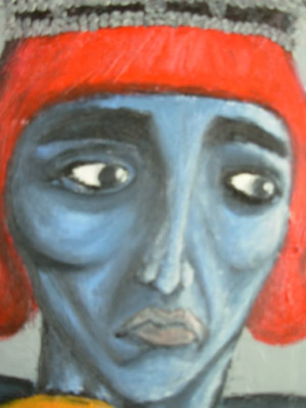
 This one's a guy with a crown and a princely hairdo. He looks pretty weird, even aside from the expression on his face. At this point, I knew the painting was going to be a mess.
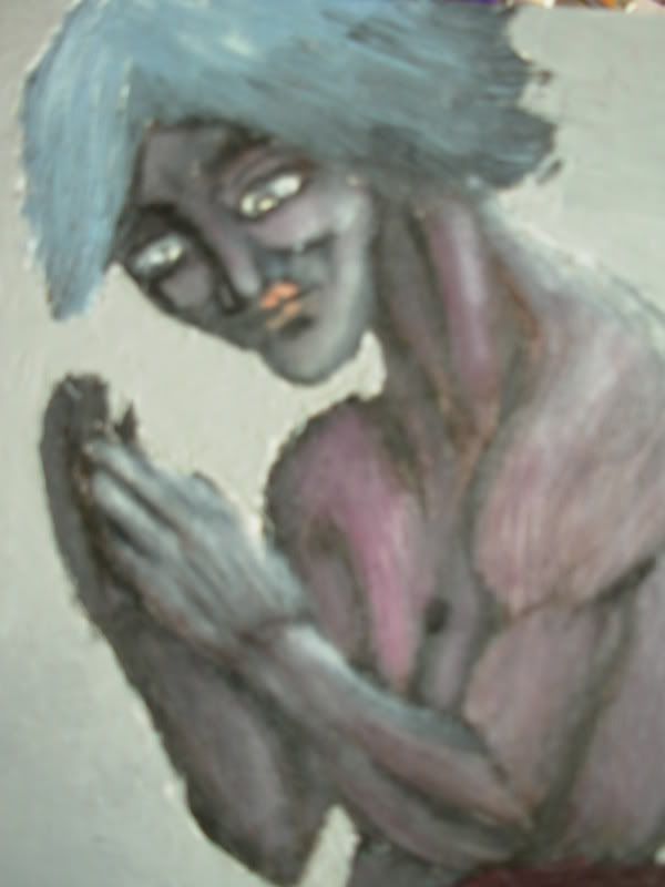
 This guy's the only one with a body. It looks horrible. Horrible.
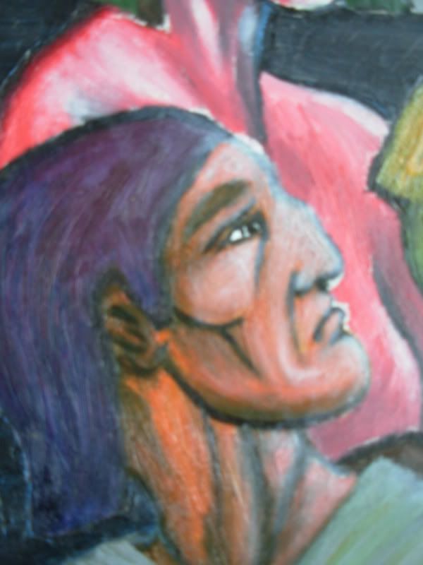
 I think I was going for a Greek profile here.
 Hmm. Horrible.
 This one I actually like. The colours, that is.
 There are no words to describe these really... I'm glad I've come a long way since this painting.
He visualized the national epic of Finland, Kalevala, in a completely original way. Here is an example, called Lemminkäisen äiti, depicting Lemminkäinen and his mother. Lemminkäinen was a kind of a tragic hero, who shot a swan and got thrown into the river of Tuonela (a kind of an underworld) by some lapplander, and his mother had to fish him out and put him back together. Poor guy was only doing what he was told by an evil woman, Louhi, who had promised Lemminkäinen the daughter of Pohjola as a bride.

Gallen- Kallela often used clear, dark outlines, and the paintings depicting stories from Kalevala were all painted like this. I'm not a huge fan of Gallen-Kallela's other works, even though they're interesting in their own right and skillfully done (the following is called Ad Astra, which means "towards the stars" or something like that):
 His other works are either symbolist, or depict African scenery. I'm not that much into symbolism, and I'm not so crazy about Africa, either. It's the Kalevala pictures I like the most. The linear style was often combined with a realistic painting of the actual figures in the pictures, and that's what I nowadays always do without even thinking about it.
So here's one of my first attempts at linear painting. I was quite cautious about smudging the outlines with the inner colour.
The composition is pretty confusing, there's no perspective, and all the figures stare in different directions. The painting as a whole is hard to take in, so I've divided it in individual portraits.This is supposed to be an Egyptian woman. I'm not sure if there's anything Egyptian to her features except the hairstyle, and perhaps the thick eyebrows (remember Elizabeth Taylor from Cleopatra?). However, I adore the combination of grass green, white and salmon.
This one's a guy with a crown and a princely hairdo. He looks pretty weird, even aside from the expression on his face. At this point, I knew the painting was going to be a mess.This guy's the only one with a body. It looks horrible. Horrible.I think I was going for a Greek profile here.Hmm. Horrible.This one I actually like. The colours, that is.There are no words to describe these really... I'm glad I've come a long way since this painting.
Wednesday, 12 September 2007
Penile Landscape.
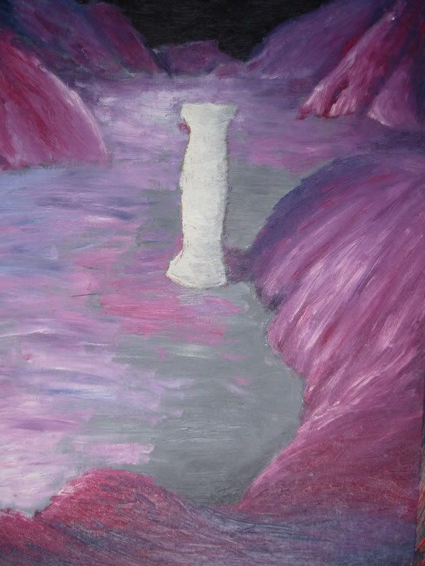
It is time to introduce the first ever oil painting I've done (actually the second one, but since the first one is missing...). I had just bought my oil colours, water soluble ones, and I was trying to get the knack of using them. Back then, I still imagined I could do landscapes.
It is easy enough to try and create effects of shadow and light using only one colour, red. I'm actually quite happy with how the back of the picture looks to be darker than the front. As a model, I used a black-and-white photo of a quarry somewhere, believe it or not. There was a floodlight around the middle of the photo, and I just tried to imitate the way everything was lighted by it.
I love the almost unmixed red streaks next to the purple overall colours. I suppose I had an idea of painting a landscape on some moon, or a lifeless exoplanet, with an ominous atmosphere to it. But don't ask me what I was thinking with the phallos symbol in the middle.
Ok, I found the original photo.

So I got this from a stock photography site, but they'll never notice... it's not like I'm putting it here to decorate my site or to earn with it. I'm not sure if it really is a quarry or not - but the tower, whatever it is, obviously became the phallos/Doric column in the painting... I'm quite fond of this photo. It looks like it could be from the Moon or something.
Thursday, 30 August 2007
Mary andJesus.
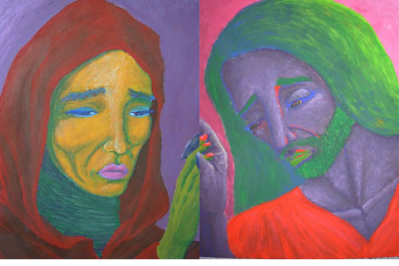
Long before I ever ventured into buying oil colours, I got myself gouache colours. I'd tried them at school, and I had really liked the vividness and richness of the pigment in them, and the easiness of using them. They're about as easy or difficult to use as water colours, only with lots more pigment.
So I decided to paint something nice for my parents for a Christmas present, as I think it's always nicer to give something you actually did yourself, instead of just buying something that anybody can buy at a shop. Even if you're not that good at 'creating' anything, it's the thought that counts, and the hours you've spent doing it.
Meet Mary and Jesus. This was during a time when I'd taken an art history course at uni. I was really inspired by the medieval art that was so imbued with religious spirit and motifs. I thought it was a wonderful generalization from the teacher to say that medieval art was characterized by religiousness, both in its subject-matters and functions.
'Medieval' is a great word isn't it: you can sum up in one word an era that spanned several hundred years. And nothing ever changed, right? There was no progress during that whole time, people lead short and miserable lives in dread of God and Hell and purgatory, plagues decimated the population of Europe several times, and intellectual thought was backward and inextricably religious and dogmatic. This is what I 'learned' from Stargåte.
It's really amazing how blindingly bright colours you can get with gouache. And using an oil brush, you can even use a similar technique as you would with oil colours. It's what I did when painting the hood on the woman, sorry Mary, and the clothes. I'm quite proud of the hood in particular, it almost looks like fabric could really fold like that.
One trick I often use is to draw the contours, lines and shadows with a colour that's very different from the base colour, something bright, not just some dark colour. On Jesus, I used scarlet and ultramarine blue, on Mary, green. I love the effect.
I painted these two separately, but intended them to be placed next to each other, holding hands. The colours don't match here, as you can see from the hands, but that's because the photo didn't replicate the colours as it should have. It's no bid deal though, since it's only the fingers of Jesus that were supposed to match.
Wednesday, 22 August 2007
Let's Roll.
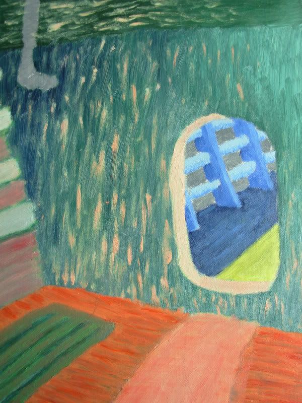
I thought I'd start with the least impressive of my works. (As if any of them were that impressive in the first place...) This is an interior of a spacecraft (duh). I'd love to be able to paint things like rooms and buildings, but I'm hopeless with rulers and dividers. I can't draw a straight line!
But I like the colours in this one, anyway. I tried to create that effect of distance between the viewer and the 'back' of the picture/back of the room by using warm colours for the anterior section, and cold colour for the section you can see through the doorway. But obviously I didn't follow that through, and the result is rather pathetic.
I get my kicks from colours. I don't ever paint things in local colours (their real-life colours, even with the effects of shadows or light), I'm only concerned with how the colours in the painting go together. I usually choose one or two bright, unmixed colours, and blend them with black and white. Often I don't like the colour I chose at first, so I just keep adding other colours until I'm satisfied.
In this picture, you can see that I tried that technique of using small brush strokes, changing the colour little by little from one end of the room to the other. I really admire it when someone can do that and really create the effect of smoothly changing colour. Here, it just looks messy.
Disappointed as I am with this one, there are some nicer pictures I'm actually decently happy with. I mean, you seriously should keep coming back to check them out some day.
Monday, 20 August 2007
Never thought I'd start a blog.
But here I am, writing one. I still fail to see what's so wonderful and revolutionary about blogs that even the biggest dailies are publishing excerpts from them. Especially when they come from blogs written by politicians, celebrities, or boring people in general... Anyways, my aim here is to 'publish' my paintings, in order to get some feedback (which I probably won't even get but what the heck), not so much to write about my deep, meaningful thoughts.
I suppose I could just load my pictures in Deviant Art or other such website, where newbies get noticed and it is easier to get feedback from lots of people. But god, the layout is horrible! Dark green, grimy, muddy and depressing... just what you need to get inspirational and creative?! I just don't get some website layout designers.
So, let's get down to business. I bought oil colours two years ago ( I think). I did one painting with oil paints in senior high school and I quite liked the richness of colour that they give, and the way you can do almost anything with them. If I recall correctly, that picture had some man with a moustache and a predator (from the movie). My teacher was quite impressed, he said I'm a colourist. But he was impressed by a lot of things. Alas, when I wanted to take my painting home with me after graduating, my teacher had lost it already. I think somebody stole it. It happened often in my school... the nicest pictures and other pieces of art always went missing.
After buying the colours, I painted dozens of pictures during the first couple of weeks, and lots more over the year. Last year I only painted about ten or so, and this year, nada. I still get inspired by many things, but over the last year I simply haven't had time to paint. However, having almost finished my Master's thesis now, I hope to continue to paint new pictures. There's nothing more relaxing than painting for hours on end in some kind of a trance.
And before you get too excited, mind you that I'm a total beginner. I had to learn the techniques (if you can refer to my ways of painting with such a fine word) by myself, i.e. I don't have much of a technique. I paint like a kid, splurt some colour out of the tube, take my brush and spread the colour on the canvas (really a cardboad plate covered with canvas). If I'm feeling impatient, I do very quick sketches and end up adding different colours until the picture is pretty much just one big smudge of grey. If I'm chill and relaxed, I like to work more carefully and add details as best I can.
I get my inspiration mostly from music, movies, pictures, photos, and occasionally from books. I tend to be motivated visually, but sometimes I'm drawn to lyrics and try to visualize them, or the feelings that the melodies evoke in me.
Movies are great for getting inspired. I love science fiction films, my first love was probably the Alien movies. I still like the first one best, even though it doesn't look so hightech anymore. It's the atmosphere that's so gripping, it keeps me daydreaming. And the aliens are so darn aesthetic that you can't help but admire their physique. They're so brutal, yet so graceful and elegant.
One of my cardinal flaws is that I can't really paint landscapes, even though that's exactly what I'd like to do when I see a particularly inspiring movie. I'm completely hopeless at creating any feel of depth, and that's quite elemental in landscapes... I know it is a matter of learning the right technique, but I'm not a very patient person. I want it all, and I want it now. So it's not gonna happen.
So I stick to painting people. Not even whole people, but faces, and usually also their necks and maybe even shoulders. I could probably paint realistic looking bodies if I practised, but I don't really find that interesting. I'm just drawn to beautiful, interesting faces. I don't often paint faces out of my own imagination, but rather, I try to paint portraits of celebrities that I dig. (Is it cool anymore to say that you 'dig' something? Probably not. Then again, I'm not cool.)
One person whose beauty I endlessly admire is Avril Lavigne. I've been a fan of hers ever since her debut album, in 2002. It's been a long time, and I'm not a teenager anymore. But I'm a loyal fan, I suppose, and a sucker for nostalgia... Another celeb I find fascinating is Jessica Alba. From Dark Angel. Not only do I think that she's so pretty, but also very intelligent. A third female who I admire is Katee Sackhoff. She's the new Starbuck from Battlestar Galactica. She's so sexy, flirty, beautiful, fit, funny, clever... and all in such a refreshing, unusual way. But hey, I'm not inclined that way - I do paint males, as well. But they're actually more difficult to paint, so...
Despite my many attempts at portraits, I'm not even half good at them. It's crazy how the subtlest change in the shadowing or the outlines of a face can make it look like a completely different person. But I'm resilient, I'll keep trying and getting better. I see some sort of progress with each new painting.
You're most likely bored out of your wits by now, so I'll stop here. I can add more boredom later for you (yes you, you non-existent reader), perhaps even a picture! I just wanted to introduce me and my mightly goals with this blog.
Subscribe to:
Posts (Atom)