Sunday, 4 May 2008

Avril Lavigne-ish.

I think you can see part of my carpet right there. And there appears to be a speck of something on the lady's boob. Meh.

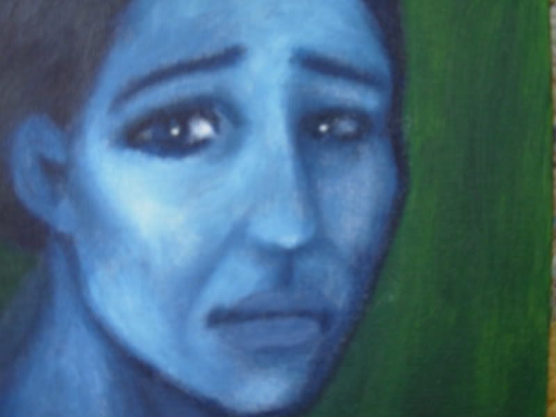
Anyways. I modelled this one on this picture of Avril Lavigne, my favourite singer who should seriously consider growing up one of these days. The playing-a-teenager was fun for a while, but I've been over it since time immemorial. Thank heavens she's planning her next album already.

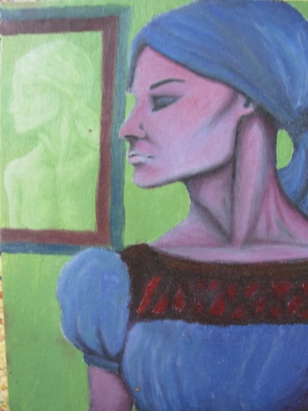
It's not a complete success as a painting, but close enough. I'm surprised I had the patience to try and make the clothing resemble real clothing, remotely at least. I'm amazed I was able to use green and blue and - horror of horrors - violet! Those have got to be the most depressing colours I know. Especially green and blue together, makes you want to go kill yourself.

I'm getting kind of excited about my poster presentation at QITL-3 in Helsinki on June 2nd, 2008. Beginning at 17:20. Not that I'm advertising or anything, since Amoena is the only reader I have. Oh, and they put my name and the non-final title of my presentation on the site, looky here. I was a little shocked over seeing this - I thought there would be dozens more presenters, but I'm actually one of only a handful! Panic panic!

It made me think, am I one of the lucky few who got chosen, or were there in fact only about five more to consider in addition to those chosen?? I'm inclined to think they didn't get that many abstracts overall, as mine was such a mess. They were just interested in seeing what I had to say, messiness aside.

Gah. My abstract went through a complete revision, as I realised there's no way in hell I can discuss well enough everything that I had planned. My title had to be modified as well, albeit slightly. I'm hoping no one will notice and be mad. I feel like such a rookie now. Oh, the shame.

This is the first time I've worked with Powerpoint. It's even easier than I thought. I had to create these two slides with which I should introduce myself and my topic. Haven't quite figured out yet how to express my main points without giving it all away.

I mean, it could be something like 'what factors can be found to affect the said variation?', which isn't saying anything at all and would not excite anybody's intrest. But I like the idea of formulating it as a question.

Perhaps something like 'do these factors affect the said variation? Stay tuned for my data', from which you can already guess that they do in fact affect it... And I'm not entirely convinced people will come to see the poster just to see loads of tables that are quite hard to take in, even for myself. However, it is quantitative investigations in theoretical linguistics, so I suppose everyone will be just psyched about numbers and figures and fancy-looking tables.

But for my actual presentation, I'll have to create a poster. I'm thinking I'll just print out a bunch of A4 sheets, boringly in black and white. Maybe I could draw some flowers or something for decorative purposes. Or a horsie. Wouldn't that be swell.

Monday, 28 April 2008

Jessica.

I'm in full swing now. I should be reading for my exam, but this'll only take like five minutes.

This is supposed to be Jessica Alba. As per usual, the resemblance is not exactly striking.

I love the combination of creamy yellow and ocean blue/green. This one was fun to do because it was so quickly done. I like quick sketches the best really, even though I get the best results if I focus and spend hours on it. It's only on the rare occasion that I can calm myself down enough to do so.

I'm thinking it's time to paint something new for a change, as these dusty (they truly are covered with dust, as it sticks onto oil colour very easily) old pictures that I don't like so much anymore. Besides, I actually have some extra time to do something else other than study for a change. Too bad any new paintings won't translate into new postings here any time soon, as I don't own a digital camera.

Thanks for Amoena for the flattering comments by the way. ^^ Are you sure you don't know how to move around the title and subtitle of my blog? It's annoying that they're so hard to see now with that background. I love that picture and I want to keep it. Please Amoena, pimp my blog!

Sunday, 27 April 2008

Whatever.

This was originally supposed to be another Samantha Morton. As far as I can recall. It turned into a young girl. And the colours went all dirty.

I don't like using dirty colours much. I want them bright and breezy. But when I'm desperately trying to get the features right, it sometimes happens that what were originally nice and bright colours, become something else. This one was soon beyond salvation. However, I'm quite happy with everything else about it. Except for the fact that she seems to be wearing a wig of some kind.


Friday, 25 April 2008

Alienation.

I'm not sure where I stand with these even square canvas cardboards. It's surprisingly difficult to design the arrangement of the characters and the cropping in particular. Most importantly, I tend to run out of space.

Generally, I like to crop my characters partly out of the picture. That is, if I give any thought to the layout. I don't always do so, which tends to result in somewhat stagnant pictures. Too tiny painting surfaces help prevent that.

Pink and dark blue = yummy. I used a sponge on the background. It saves a lot of paint and makes it easy to create a misty look.

Thursday, 24 April 2008

Words elude me.

The colours are just delicious here. Nevermind the egghead.

I like using scarlet and mixing it partly with white, it's such a dramatic combination. It's usually best to take your colour straight from the tube and only add black or white. Once you go too far with the mixing, it will be difficult to modify your painting later. Not that I would ever do that anyway. Either I nail it in one sitting, or I don't. At all.


Sunday, 23 March 2008

Samantha Morton.

She was great in the Libertine, which had Johnny Depp as the libertine, i.e. John Wilmot, the Earl of Rochester. I barely recognized Johnny from the cover of the film casing, and I actually thought there was some mistake with that picture, as the screenshots on the back cover obviously had Johnny in them. But the film was amazing, you definitely should see it.

I was so impressed by Samantha that I rented Code 47 shortly afterwards (or 46, I can never remember which it was). It's a scifi film where code 47 means that you shouldn't have sex with your family member. The idea, as far as I can remember, was that people were created often from dna samples, so it was possible to meet a stranger your age who was, dna-wise, your mother/father/sister/brother. Creepy. And hence the possiblity of becoming attracted to your genetic mother/whomever and engaging in incestuous intercourse. Whatever floats your boat I suppose, but at least they tried to avoid it.

The core of the film is a sad love story between an older man and a younger woman, she being the genetic mother of the man, if I recall correctly. (God forbid that I should check all of these points in imdb.) The music was so sad as well.

This painting isn't the spitting image of Samantha, but I like it anyway. Don't the black dashes almost look like they were done with a marker pen? I like the cartoony effect you get from clear black lines. But there seems to be something weird going on with the image file, as it looks to have some strange stripes all over it. Harumph.

Sunday, 9 March 2008

More FPS beauty.

Here is one more character inspired by Half Life 2. The original model can be found here. There isn't that much resemblance, but I don't really care. I gave it to my dad as a xmas present, and he liked it. Nothing else matters.

My mind is kind of empty right now. I just wanted to post before I forget about this blog, again.