Monday 28 April 2008

Jessica.

I'm in full swing now. I should be reading for my exam, but this'll only take like five minutes.

This is supposed to be Jessica Alba. As per usual, the resemblance is not exactly striking.

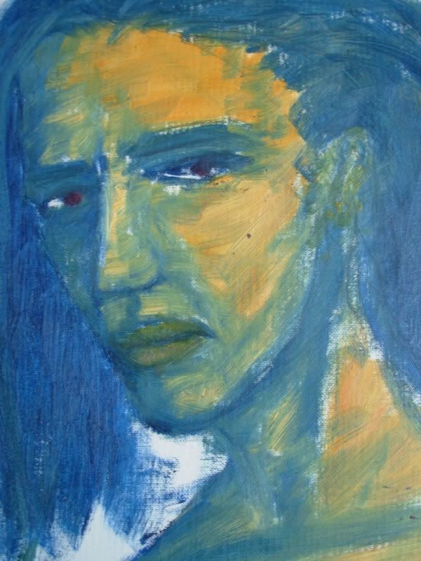
I love the combination of creamy yellow and ocean blue/green. This one was fun to do because it was so quickly done. I like quick sketches the best really, even though I get the best results if I focus and spend hours on it. It's only on the rare occasion that I can calm myself down enough to do so.

I'm thinking it's time to paint something new for a change, as these dusty (they truly are covered with dust, as it sticks onto oil colour very easily) old pictures that I don't like so much anymore. Besides, I actually have some extra time to do something else other than study for a change. Too bad any new paintings won't translate into new postings here any time soon, as I don't own a digital camera.

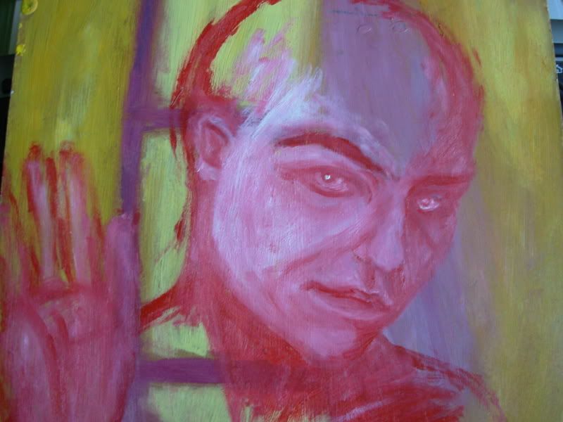
Thanks for Amoena for the flattering comments by the way. ^^ Are you sure you don't know how to move around the title and subtitle of my blog? It's annoying that they're so hard to see now with that background. I love that picture and I want to keep it. Please Amoena, pimp my blog!

Sunday 27 April 2008

Whatever.

This was originally supposed to be another Samantha Morton. As far as I can recall. It turned into a young girl. And the colours went all dirty.

I don't like using dirty colours much. I want them bright and breezy. But when I'm desperately trying to get the features right, it sometimes happens that what were originally nice and bright colours, become something else. This one was soon beyond salvation. However, I'm quite happy with everything else about it. Except for the fact that she seems to be wearing a wig of some kind.


Friday 25 April 2008

Alienation.

I'm not sure where I stand with these even square canvas cardboards. It's surprisingly difficult to design the arrangement of the characters and the cropping in particular. Most importantly, I tend to run out of space.

Generally, I like to crop my characters partly out of the picture. That is, if I give any thought to the layout. I don't always do so, which tends to result in somewhat stagnant pictures. Too tiny painting surfaces help prevent that.

Pink and dark blue = yummy. I used a sponge on the background. It saves a lot of paint and makes it easy to create a misty look.

Thursday 24 April 2008

Words elude me.

The colours are just delicious here. Nevermind the egghead.

I like using scarlet and mixing it partly with white, it's such a dramatic combination. It's usually best to take your colour straight from the tube and only add black or white. Once you go too far with the mixing, it will be difficult to modify your painting later. Not that I would ever do that anyway. Either I nail it in one sitting, or I don't. At all.