But here I am, writing one. I still fail to see what's so wonderful and revolutionary about blogs that even the biggest dailies are publishing excerpts from them. Especially when they come from blogs written by politicians, celebrities, or boring people in general... Anyways, my aim here is to 'publish' my paintings, in order to get some feedback (which I probably won't even get but what the heck), not so much to write about my deep, meaningful thoughts.
I suppose I could just load my pictures in Deviant Art or other such website, where newbies get noticed and it is easier to get feedback from lots of people. But god, the layout is horrible! Dark green, grimy, muddy and depressing... just what you need to get inspirational and creative?! I just don't get some website layout designers.
So, let's get down to business. I bought oil colours two years ago ( I think). I did one painting with oil paints in senior high school and I quite liked the richness of colour that they give, and the way you can do almost anything with them. If I recall correctly, that picture had some man with a moustache and a predator (from the movie). My teacher was quite impressed, he said I'm a colourist. But he was impressed by a lot of things. Alas, when I wanted to take my painting home with me after graduating, my teacher had lost it already. I think somebody stole it. It happened often in my school... the nicest pictures and other pieces of art always went missing.
After buying the colours, I painted dozens of pictures during the first couple of weeks, and lots more over the year. Last year I only painted about ten or so, and this year, nada. I still get inspired by many things, but over the last year I simply haven't had time to paint. However, having almost finished my Master's thesis now, I hope to continue to paint new pictures. There's nothing more relaxing than painting for hours on end in some kind of a trance.
And before you get too excited, mind you that I'm a total beginner. I had to learn the techniques (if you can refer to my ways of painting with such a fine word) by myself, i.e. I don't have much of a technique. I paint like a kid, splurt some colour out of the tube, take my brush and spread the colour on the canvas (really a cardboad plate covered with canvas). If I'm feeling impatient, I do very quick sketches and end up adding different colours until the picture is pretty much just one big smudge of grey. If I'm chill and relaxed, I like to work more carefully and add details as best I can.
I get my inspiration mostly from music, movies, pictures, photos, and occasionally from books. I tend to be motivated visually, but sometimes I'm drawn to lyrics and try to visualize them, or the feelings that the melodies evoke in me.
Movies are great for getting inspired. I love science fiction films, my first love was probably the Alien movies. I still like the first one best, even though it doesn't look so hightech anymore. It's the atmosphere that's so gripping, it keeps me daydreaming. And the aliens are so darn aesthetic that you can't help but admire their physique. They're so brutal, yet so graceful and elegant.
One of my cardinal flaws is that I can't really paint landscapes, even though that's exactly what I'd like to do when I see a particularly inspiring movie. I'm completely hopeless at creating any feel of depth, and that's quite elemental in landscapes... I know it is a matter of learning the right technique, but I'm not a very patient person. I want it all, and I want it now. So it's not gonna happen.
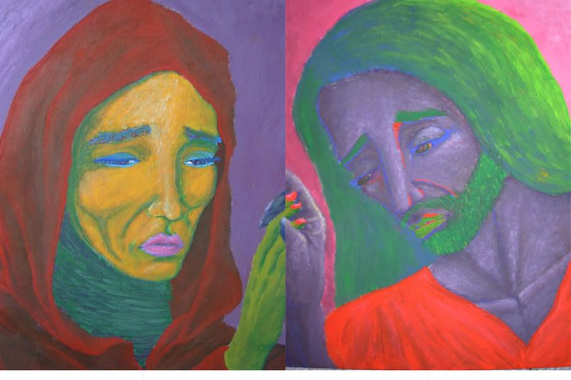
So I stick to painting people. Not even whole people, but faces, and usually also their necks and maybe even shoulders. I could probably paint realistic looking bodies if I practised, but I don't really find that interesting. I'm just drawn to beautiful, interesting faces. I don't often paint faces out of my own imagination, but rather, I try to paint portraits of celebrities that I dig. (Is it cool anymore to say that you 'dig' something? Probably not. Then again, I'm not cool.)
One person whose beauty I endlessly admire is Avril Lavigne. I've been a fan of hers ever since her debut album, in 2002. It's been a long time, and I'm not a teenager anymore. But I'm a loyal fan, I suppose, and a sucker for nostalgia... Another celeb I find fascinating is Jessica Alba. From Dark Angel. Not only do I think that she's so pretty, but also very intelligent. A third female who I admire is Katee Sackhoff. She's the new Starbuck from Battlestar Galactica. She's so sexy, flirty, beautiful, fit, funny, clever... and all in such a refreshing, unusual way. But hey, I'm not inclined that way - I do paint males, as well. But they're actually more difficult to paint, so...
Despite my many attempts at portraits, I'm not even half good at them. It's crazy how the subtlest change in the shadowing or the outlines of a face can make it look like a completely different person. But I'm resilient, I'll keep trying and getting better. I see some sort of progress with each new painting.
You're most likely bored out of your wits by now, so I'll stop here. I can add more boredom later for you (yes you, you non-existent reader), perhaps even a picture! I just wanted to introduce me and my mightly goals with this blog.